 "valsidalv, reminding you that infiniti is an option" (valsidalv)
10/09/2020 at 10:45 • Filed to: None
 2
2
 40
40|
"valsidalv, reminding you that infiniti is an option" (valsidalv)
10/09/2020 at 10:45 • Filed to: None | 2
| 40 |
I want to understand the thought process behind this - maybe this resonates with some people? Because w henever I see this I just think they don’t deserve my business .
Screenshot: me
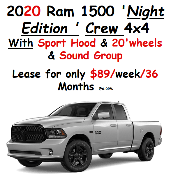
So this first one: 1) extra underlined space after “Night Edition” 2) underline broken between “Night Edition” and “Crew” for no good reason 3) “4x4" is not underlined but “With” is (and capitalized) 4) I am amazed they’re able to fit 20' wheels on this thing.
Screenshot: me
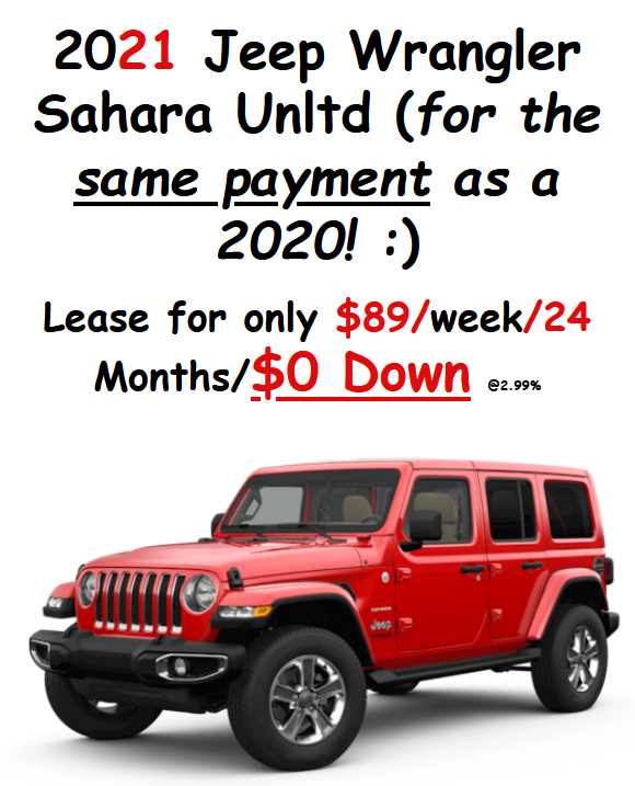
Ugh 1) the open bracket explaining the payment ends in a ‘ smiley face bracket’ 2) trigger happy with the slashes... this reminds me of someone using equal signs continuously which is not how they work!!!

Screenshot: me
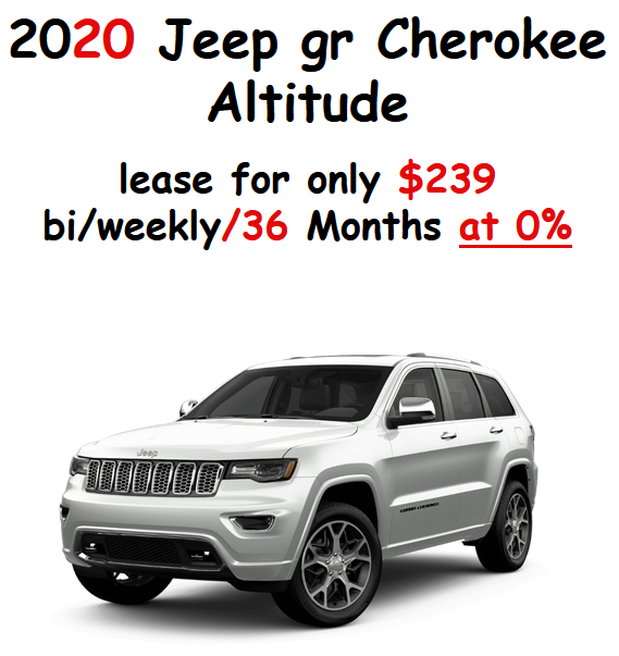
1) Is it too hard to dignify the dying minivan by at least writing out its full name? 2) WTF does the plus sign represent?
Screenshot: me
1) If you’re going to ignore the word “Grand” in your model names at least be consistent - why is it “G” for the Caravan and “gr” for the Cherokee? 2) That is not how you spell “bi-weekly”
 Who is the Leader - 404 / Blog No Longer Available
> valsidalv, reminding you that infiniti is an option
Who is the Leader - 404 / Blog No Longer Available
> valsidalv, reminding you that infiniti is an option
10/09/2020 at 10:52 |
|
I think they could save money and increase quality be outsourcing this to middle school English classes.
Not to mention the font and color scheme already makes me think of a child with markers. I think the quality of these graphics are about on par with the quality of their service.
 RamblinRover Luxury-Yacht
> valsidalv, reminding you that infiniti is an option
RamblinRover Luxury-Yacht
> valsidalv, reminding you that infiniti is an option
10/09/2020 at 10:53 |
|
 Just Jeepin'
> valsidalv, reminding you that infiniti is an option
Just Jeepin'
> valsidalv, reminding you that infiniti is an option
10/09/2020 at 10:55 |
|
At least they didn’t commit the classic sin of putting something important inside double quotes with the intention of emphasizing it and the effect of making it look like you’re mocking it.
 ShrimpHappens, née WJalopy
> valsidalv, reminding you that infiniti is an option
ShrimpHappens, née WJalopy
> valsidalv, reminding you that infiniti is an option
10/09/2020 at 10:56 |
|
Maybe it’ s a boomer that thinks they’re super creative, yet no one has the heart or cojones to say anything because of the fuss it’d cause to have that convo.
Maybe it’s a power-tripping micromanager that delivers hand-drawn Sharpie sketches and demands they be done exactly the way he drew them.
|
RamblinRover Luxury-Yacht
> Just Jeepin'
10/09/2020 at 10:58 |
|
At Ambiguity Nissan, “we care”.
 nermal
> valsidalv, reminding you that infiniti is an option
nermal
> valsidalv, reminding you that infiniti is an option
10/09/2020 at 10:58 |
|
It wasn’t a child that did that, it was a boomer.
 Cash Rewards
> valsidalv, reminding you that infiniti is an option
Cash Rewards
> valsidalv, reminding you that infiniti is an option
10/09/2020 at 11:00 |
|
I work for a federal regulatory agency that has a relatively new and somewhat combative relationship with industry. From one company we would receive submissions just like this. For years I thought they were passive aggressively fucking with us. Turns out, the task of submitting the documents to us got tasked to some old office drone. He was like “better use another font to make sure them folks in Washington can find our answers real easy” and was so old and computer un-savy that he thought comic sans was the way to go.
 ClassicDatsunDebate
> valsidalv, reminding you that infiniti is an option
ClassicDatsunDebate
> valsidalv, reminding you that infiniti is an option
10/09/2020 at 11:01 |
|
 WasGTIthenGTOthenNOVAnowbacktoGTI
> valsidalv, reminding you that infiniti is an option
WasGTIthenGTOthenNOVAnowbacktoGTI
> valsidalv, reminding you that infiniti is an option
10/09/2020 at 11:06 |
|
The real question is why are the lease amounts sectioned into weekly and bi-weekly amounts? (I kno w why, and it’s pathetic )
 Thomas Donohue
> valsidalv, reminding you that infiniti is an option
Thomas Donohue
> valsidalv, reminding you that infiniti is an option
10/09/2020 at 11:06 |
|
I’m going to guess they actually copied an old add, and the replaced text was in a different color. And.....they didn’t know how to change that? Dunno.
Ne arly all the items in red are variables.
|
WasGTIthenGTOthenNOVAnowbacktoGTI
> Who is the Leader - 404 / Blog No Longer Available
10/09/2020 at 11:07 |
|
* C ough* and vehicles * Cough*
|
WasGTIthenGTOthenNOVAnowbacktoGTI
> ShrimpHappens, née WJalopy
10/09/2020 at 11:08 |
|
Or it’s someone doing the BARE minimum because they were tasked with it.
 MrSnrub
> valsidalv, reminding you that infiniti is an option
MrSnrub
> valsidalv, reminding you that infiniti is an option
10/09/2020 at 11:09 |
|
This is a level of not giving a shit I can only respect
|
RamblinRover Luxury-Yacht
> RamblinRover Luxury-Yacht
10/09/2020 at 11:09 |
|
Anybody who recognizes the Chiller, Papyrus, and Comic Sans here by sight has my sympathy.
|
RamblinRover Luxury-Yacht
> Cash Rewards
10/09/2020 at 11:11 |
|
I’m not saying I would send paperwork to a government agency in Comic Sans, but I’m not ruling out the possibility. One of those crimes you never know if you’re capable of until you’re up against the bricks, you know?
 QCGoose
> valsidalv, reminding you that infiniti is an option
QCGoose
> valsidalv, reminding you that infiniti is an option
10/09/2020 at 11:12 |
|
At least they used "wheels" instead of "rims".
 412GTI
> valsidalv, reminding you that infiniti is an option
412GTI
> valsidalv, reminding you that infiniti is an option
10/09/2020 at 11:14 |
|
Ugh as someone who creates these types of ads for our dealership group, this makes me want to throw up. Has to be some older person making those ads lol
|
Who is the Leader - 404 / Blog No Longer Available
> WasGTIthenGTOthenNOVAnowbacktoGTI
10/09/2020 at 11:15 |
|
Harsh but accurate.
 ibRAD
> RamblinRover Luxury-Yacht
ibRAD
> RamblinRover Luxury-Yacht
10/09/2020 at 11:17 |
|
Relevant:
https://www.mcsweeneys.net/articles/im-comic-sans-asshole
 Future next gen S2000 owner
> valsidalv, reminding you that infiniti is an option
Future next gen S2000 owner
> valsidalv, reminding you that infiniti is an option
10/09/2020 at 11:28 |
|
Gotta reduce the staff, lower sales and all. Gotta put them kids to work. Earn their keep!
|
Future next gen S2000 owner
> RamblinRover Luxury-Yacht
10/09/2020 at 11:30 |
|
Some one high up at my job decided Times New Roman or Calibri was not in fashion so they made a mandate we move to Segue something or other for headings and Garamond for text. Or maybe it is the other way around.
Some people really just need to justify their job.
 functionoverfashion
> valsidalv, reminding you that infiniti is an option
functionoverfashion
> valsidalv, reminding you that infiniti is an option
10/09/2020 at 11:30 |
|
You really did hit on almost all the things I think are wrong with these ads, but one: weekly or bi-weekly payments? Maybe I need to look at more sleazy cars ads - wait, no I don’t - but that’s awful. “Hey look only 89 bucks - for a new Jeep? I got 89 bucks!”
 BrianGriffin thinks “reliable” is just a state of mind
> WasGTIthenGTOthenNOVAnowbacktoGTI
BrianGriffin thinks “reliable” is just a state of mind
> WasGTIthenGTOthenNOVAnowbacktoGTI
10/09/2020 at 11:35 |
|
I was going to comment on that, too, because it just looks weird. Also, it tricks my brain into thinking that it’s MORE of a painful payment than it is.
$360/mth to lease a truck? Not bad. But $90/week?! That sounds so awful.
|
WasGTIthenGTOthenNOVAnowbacktoGTI
> BrianGriffin thinks “reliable” is just a state of mind
10/09/2020 at 11:40 |
|
I agree, the weekly or even daily amount of my current lease makes me cringe, but somehow I’m comfortable with the monthly amount........
 CompactLuxuryFan
> functionoverfashion
CompactLuxuryFan
> functionoverfashion
10/09/2020 at 11:41 |
|
It’s actually a genius strategy to make these ads *shitty*. Then they automatically filter out anybody that can rub two brain cells together and only sure suckers respond.
|
ShrimpHappens, née WJalopy
> Future next gen S2000 owner
10/09/2020 at 11:41 |
|
Oh man, Garamond was my font in AIM for a long time when I was trying to look smart, and it’s very nearly the font the Harry Potter books are printed in.
|
ShrimpHappens, née WJalopy
> functionoverfashion
10/09/2020 at 11:44 |
|
Well, $89*52/12 = $385/month lease payment on that Wrangler Sahara. That ain’t terrible, but it’s the 24-month term that raises my eyebrows.
|
ShrimpHappens, née WJalopy
> ibRAD
10/09/2020 at 11:45 |
|
Also relevant:
|
RamblinRover Luxury-Yacht
> Future next gen S2000 owner
10/09/2020 at 11:49 |
|
I like Garamond, but that’s no reason to be *crazy*.
 nerd_racing
> valsidalv, reminding you that infiniti is an option
nerd_racing
> valsidalv, reminding you that infiniti is an option
10/09/2020 at 11:50 |
|
Kids know how to annoy adults into doing what they want them to do.
 and 100 more
> ShrimpHappens, née WJalopy
and 100 more
> ShrimpHappens, née WJalopy
10/09/2020 at 12:02 |
|
Verdana was my jam.
|
Cash Rewards
> RamblinRover Luxury-Yacht
10/09/2020 at 12:03 |
|
And that’s exactly what I was thinking, too! We’d ask them to provide documentation of blah blah blah, and we’d get it back with our question repeated in normal font and their answer below in comic sans. And I’d be like, are you fucking with me? Is this serious? Is this an commentary on what you think of my question? Do you think my agency is a joke? Are you just at the end of your rope and out of fucks to give? Am I dealing with a madman?
Nope, just a kindly old man working in an office who said “ooh, that one is distinctive!”
|
ibRAD
> ShrimpHappens, née WJalopy
10/09/2020 at 12:04 |
|
I’d forgotten about that one!
|
RamblinRover Luxury-Yacht
> Cash Rewards
10/09/2020 at 12:09 |
|
“It looks like handwriting, that way it looks like a hand-written response! I’m a genius!”
 Thisismydisplayname
> Future next gen S2000 owner
Thisismydisplayname
> Future next gen S2000 owner
10/09/2020 at 12:22 |
|
Boo! Calibri or GTFO.
 Urambo Tauro
> valsidalv, reminding you that infiniti is an option
Urambo Tauro
> valsidalv, reminding you that infiniti is an option
10/09/2020 at 12:41 |
|
These don’t even look like ads TBH. They look more like memes. And not in a good way, like they’re trying something to reach teh youths . Looks more like they’re mocking dealer ads in a way that’s a little too believable to actually be funny.
 ranwhenparked
> valsidalv, reminding you that infiniti is an option
ranwhenparked
> valsidalv, reminding you that infiniti is an option
10/09/2020 at 13:21 |
|
Wait, are weekly lease payments a thing? Who does that?
|
ranwhenparked
> RamblinRover Luxury-Yacht
10/09/2020 at 13:25 |
|
I worked for someone who loved it, it thought it looked modern and airy, so it was on every damn sign in the freaking compound - eye wash stations, phone extension lists, door signs, the flammable materials storage shed, the freaking AED, and the worst was it was always in baby blue on a white background. I submitted my inventory spreadsheets to him in Comic Sans just to try and prove the point of how overused it was, but there was no reaction.
|
ranwhenparked
> WasGTIthenGTOthenNOVAnowbacktoGTI
10/09/2020 at 13:25 |
|
This does seem to fit with someone who's job description doesn't really include this and has too much else to do to really care
 Stef Schrader
> valsidalv, reminding you that infiniti is an option
Stef Schrader
> valsidalv, reminding you that infiniti is an option
10/10/2020 at 01:14 |
|
My guess isn’t kids. It’s boomers. This is peak small-town boomer graphic design. Comic Sans is the cutesy font. Look, colors!